Over 95% of potential legal clients research law firm websites before reaching out to schedule a consultation, making web design for family lawyers absolutely critical to your firm's success. Your website serves as the central hub where prospective clients discover and connect with your practice online. Professional divorce lawyer web design paired with modern law office design elements will establish credibility and create an outstanding first impression through contemporary, user-friendly aesthetics.
Effective family law attorney website design is essential for competing in today's digital landscape and distinguishing your practice from competitors. The best family law websites combine cutting-edge design principles with strategic SEO optimization, featuring clear and compelling copy that demonstrates why your firm is the perfect choice for their legal needs.
Smart website design for family lawyers requires staying current with design trends while maintaining the professional authority that clients expect from their legal representation.
Why Web Design Matters for Family Lawyers
Family law clients are often experiencing some of the most emotionally challenging moments of their lives—divorce, child custody battles, adoption proceedings, or domestic violence situations. When they search for legal representation online, your website design immediately communicates whether your firm can provide the professional, compassionate support they desperately need.
First Impressions Drive Client Decisions
Research shows that visitors form an opinion about your website within 50 milliseconds of landing on your page. For family law practices, this split-second judgment can determine whether a potential client stays to learn more or immediately clicks away to a competitor.
Modern law office design principles applied to your website create an instant sense of professionalism and trustworthiness that reassures anxious clients they've found the right legal team.
Building Trust Through Professional Design
Family law matters require clients to share deeply personal and sensitive information. A well-designed website with clean layouts, professional photography, and intuitive navigation signals that your firm maintains the same attention to detail and professionalism in handling their case. Even seemingly small design choices like selecting the right typography can significantly impact how trustworthy and credible your firm appears to potential clients.
Outdated or poorly designed websites can raise doubts about your firm's competence and current legal knowledge.
Mobile-First Design is Non-Negotiable
Over 60% of legal searches now happen on mobile devices, with family law clients often researching attorneys during personal time—evenings, weekends, or break times at work. Divorce lawyer website design must prioritize mobile responsiveness to ensure your site loads quickly and displays perfectly across all devices.
A frustrating mobile experience will send potential clients directly to competitors with better-optimized sites.
Differentiation in a Competitive Market
The best family law websites don't just look professional—they clearly communicate what sets your practice apart. Whether it's your collaborative divorce approach, bilingual services, or specialized experience with high-net-worth cases, strategic web design for family lawyers highlights these unique value propositions through compelling visuals, clear messaging, and strategic content placement.
Conversion-Focused Design Elements
Effective family law attorney website design goes beyond aesthetics to include conversion optimization. Strategic placement of contact forms, prominent display of phone numbers, client testimonials, and clear calls-to-action guide visitors toward scheduling consultations. Every design element should work together to transform website visitors into actual clients for your practice.
4 Elements of Great Family Law Websites
Before we get into our examples and why we've chosen them, let's go over some basic principles for what makes family law firm websites effective.
When navigating family law matters such as child custody, divorce, or spousal support, clients seek a family law lawyer they can trust. An engaging and user-friendly law firm website can help establish that trust and showcase your expertise in the field.
1. Understanding the Needs of Your Potential Clients
When designing your family law attorney website, it's crucial to focus on the needs and concerns of your potential clients. Whether they are facing a difficult divorce, dealing with child custody disputes, or navigating other family law issues, understanding their emotions and challenges is key to creating a responsive design. Tailoring your content and layout to address these concerns will enhance user experience and encourage potential clients to reach out for assistance.
2. Benchmarks Against Other Law Firm Websites
To create the best family law group website, it’s often helpful to analyze other law firm websites in your area. Look at how your competitors present their services, the types of content they feature, and the overall design aesthetic. Take note of what works and areas where they may fall short. This can provide valuable insights, allowing you to differentiate your family law attorney website and showcase the unique qualities of your firm.
3. Focused Content on Family Law Matters
Your website needs to feature clear, informative content that speaks directly to potential clients. This includes discussing various family law matters in detail, including topics like child custody, property division, and alimony. The better a visitor understands your areas of expertise, the more likely they are to engage with your firm. Make sure your content answers common questions and addresses the emotional aspects of navigating family law issues.
4. Prioritizing Usability and Accessibility
Website design should always prioritize usability. Ensuring your family law lawyer website is easy to navigate will help retain visitors and improve your conversion rates. Make use of straightforward navigation menus, clear calls to action, and mobile-friendly features. Remember, when potential clients visit your site, they are often seeking immediate answers—make it easy for them to find what they’re looking for.
5 Best Family Law Website Design in 2026
Here are five great examples of family law firm websites with a breakdown of what makes each one effective to guide you on what good looks like.
1. Charlotte Christian Law
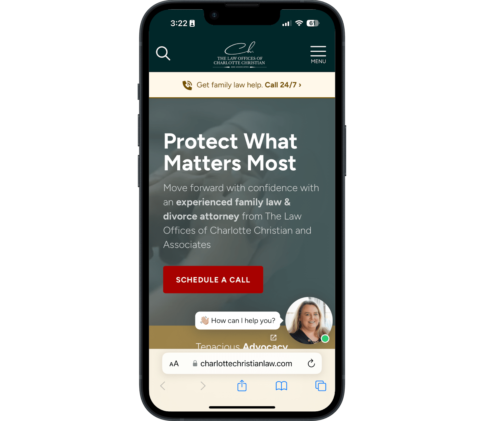
Charlotte Christian Law makes a clear and strong offering of legal services for potential clients for a few reasons. These include:
- The copy above the fold is client-focused
- The image used behind the above-the-fold copy has a darkened filter to create enough contrast so that the text is visible, which is essential for accessibility
- The "schedule a call" button is above the fold and what's known as "within the thumb zone," so it's simple for someone to find and click
- Potential clients have multiple contact options, such as a clickable phone number at the top of the page, the schedule a call button, and a chat feature
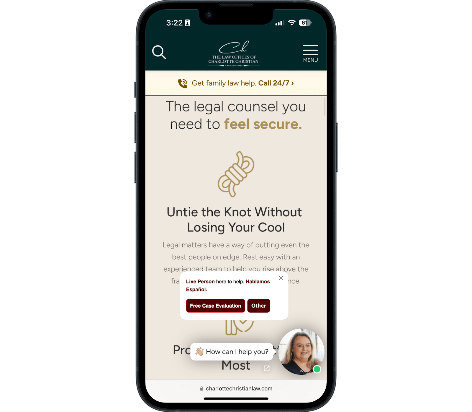
As you scroll down the home page, clients are given a clear overview of the divorce process and the services this family law firm offers.
This approach puts the client front and center, with the lawyer serving as the client's guide.
Clients can easily look at individual pages for services like alimony, child custody, or divorce for further questions, and the "schedule a call" call to action is located in multiple locations, making it easy for visitors to take the next step.
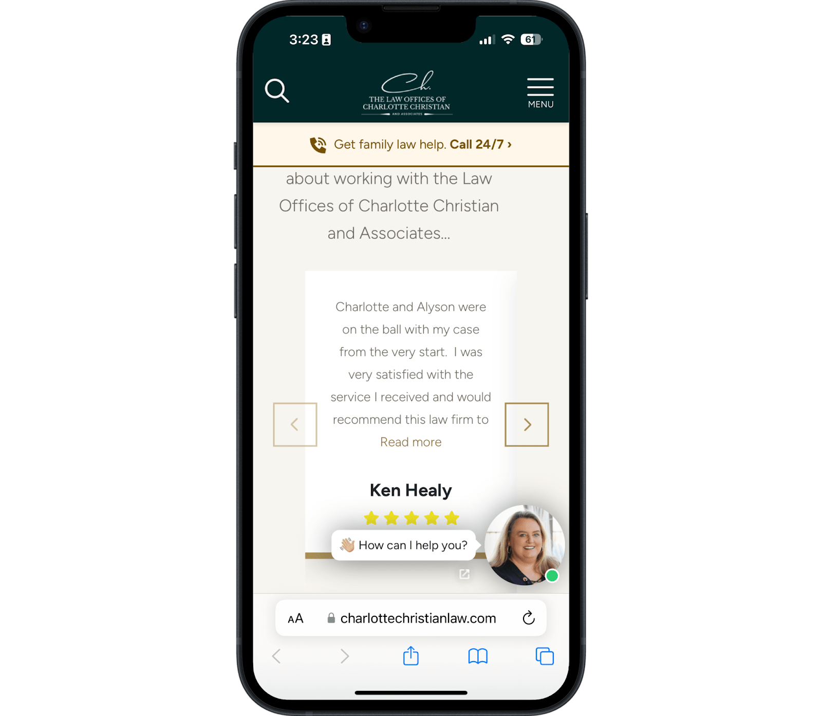
Notice how this family law firm uses social proof with a scrollable carousel?
This design pattern isn't wrong, but they could make it easier for the user by placing all of their testimonials in a vertical container so the user can continue swiping vertically—the most common and easy way to use the web on mobile.
Contact Page
This family law firm keeps its contact page simple but still includes all the information needed in a format that's easy to grasp.
This gives the visitor the information they need with the primary goal of making contacting the firm easy.
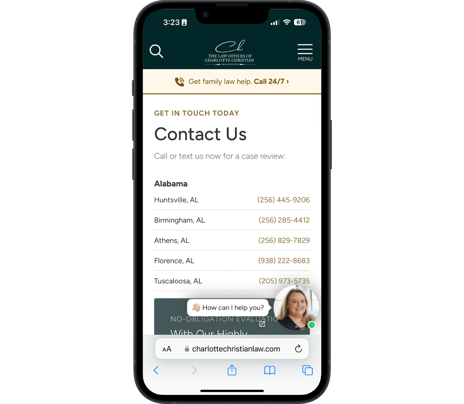
Clients can also find exactly which law office to contact to get the help the right help from the right place.
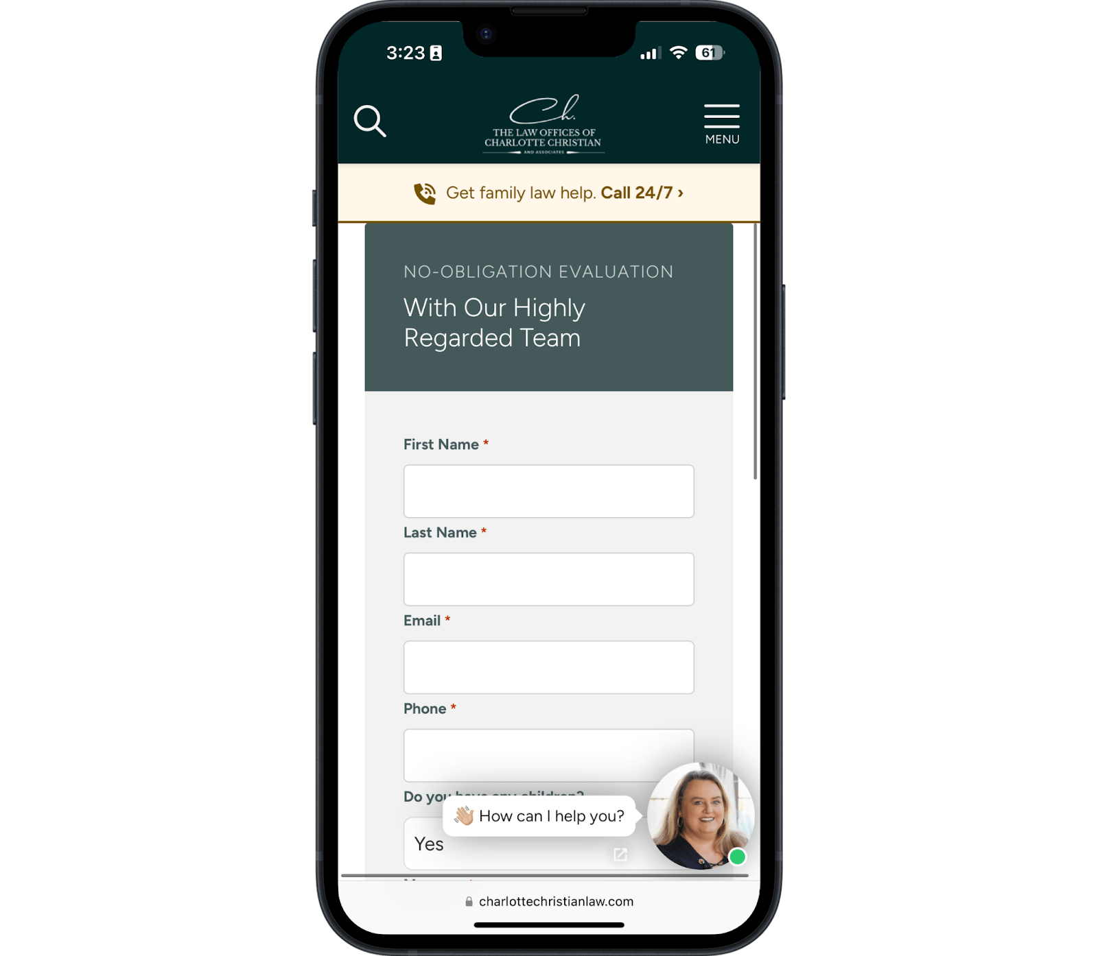
Keep your contact pages simple. Don't distract from the primary thing you want people to do. Notice how they use a simple contact form at the bottom of the page that asks as few questions as possible? Fewer questions reduce friction and increase the odds that a high-quality client fills out the form.
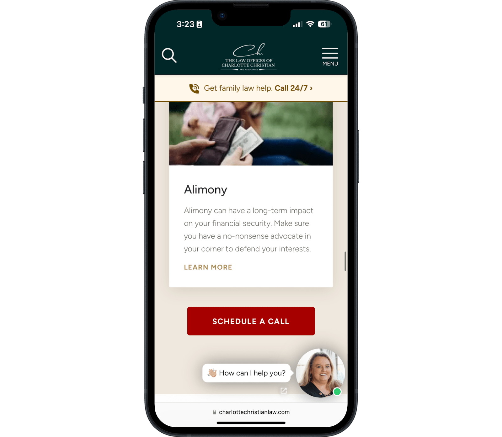
Service Pages
Service pages, or your practice area pages, are your opportunity to explain what you do, who you do it for, and what prospective clients need to know about the legal processes in your state.
State your value proposition and make it clear and straightforward what action you want them to take.
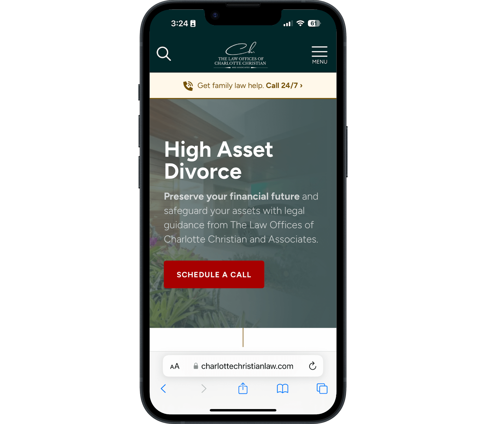
See how the headline makes the page's purpose obvious while the subheading explains the stakes?
Also, note how their background image contrasts with the text so it's still easy to read. Failing to do this is a common mistake we see across many small business websites.
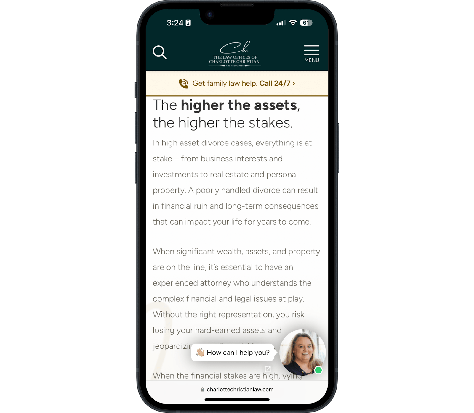
Viewers will find consistent, legible fonts and good spacing throughout the page, making the copy easy to understand and read.
Clients have enough information to understand what's involved in this legal issue and get evidence that these lawyers are experts.
Blog Posts
Their blog posts include many of the same benefits you'll see throughout service pages but also instill a vote of confidence and trust with special features in the form of “verified content” badges—something we see some of the best blogs do to improve their EEAT.
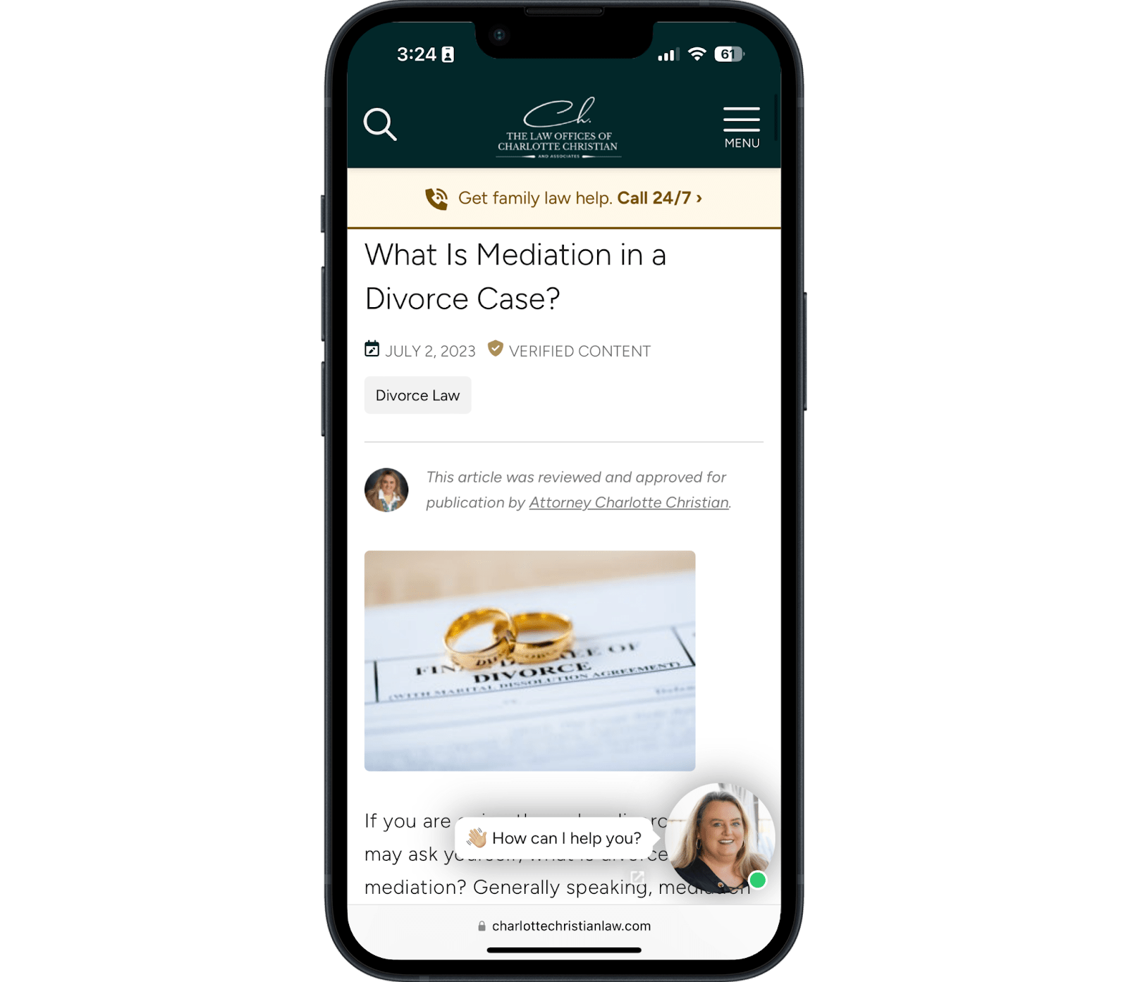
The chat option in the corner provides an instant option for clients ready to talk to someone immediately—even if it is a bit obstrusive by sitting on top of the informative content.
When creating copy for family law websites, use every opportunity to showcase authority while building expertise and trust.
About Page
You don't need to overdo it with an About Page.
- A photo of the person they'll work with
- Details about that person's important credentials
- A bio about the lawyer or firm
You can find all of that on this page.
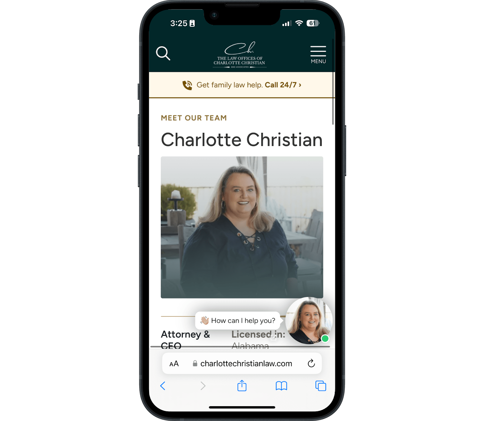
Charlotte's headshot is professional but still comes across as friendly and approachable.
As a family law attorney, you shouldn't make yourself the center of attention. You're the guide in this story, not the hero. Charlotte looks like a happy person who is ready to help you.
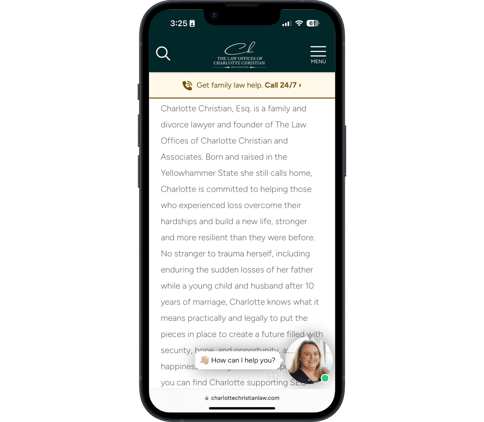
Too many lawyers write lengthy bios that most people skim or never even read. You have to balance including the credibility Google wants to see with copy that tells a story.
Experienced family law attorneys will tell a story first. Include the credentials and curriculum vitae in a separate section toward the bottom.
Avoid overused cookie-cutter statements other lawyers use (e.g., "I fight for you").
Just explain who you are and why you care. Being yourself is the most effective way for a family law practice to win the right people over and repel the wrong ones.
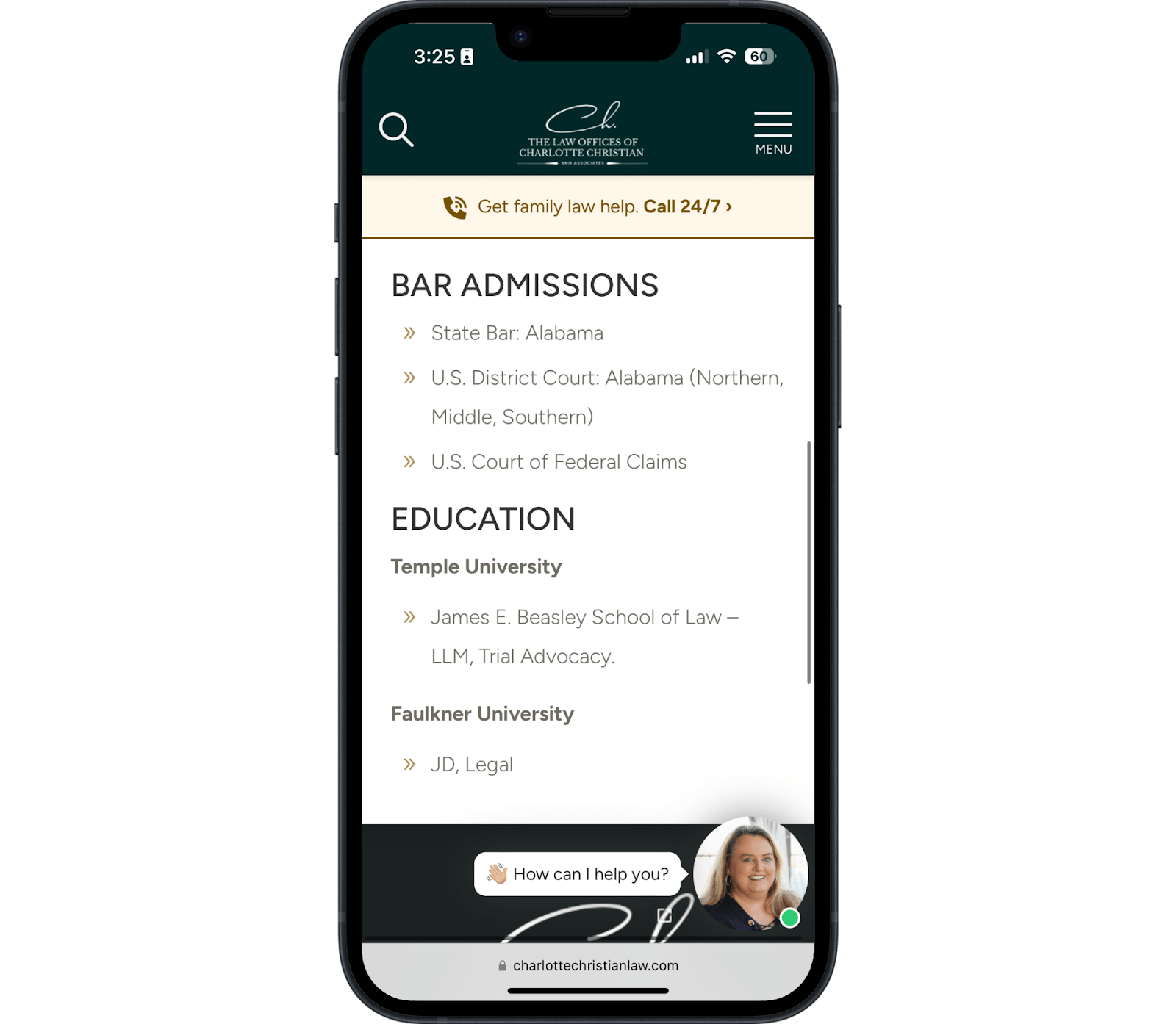
Charlotte's About Page closes with a skimmable section of her credentials.
Simple wins the day here: mention bar admissions and educational background. Even if your prospects don't pay attention or know what it means, other law firms that can refer you clients will.
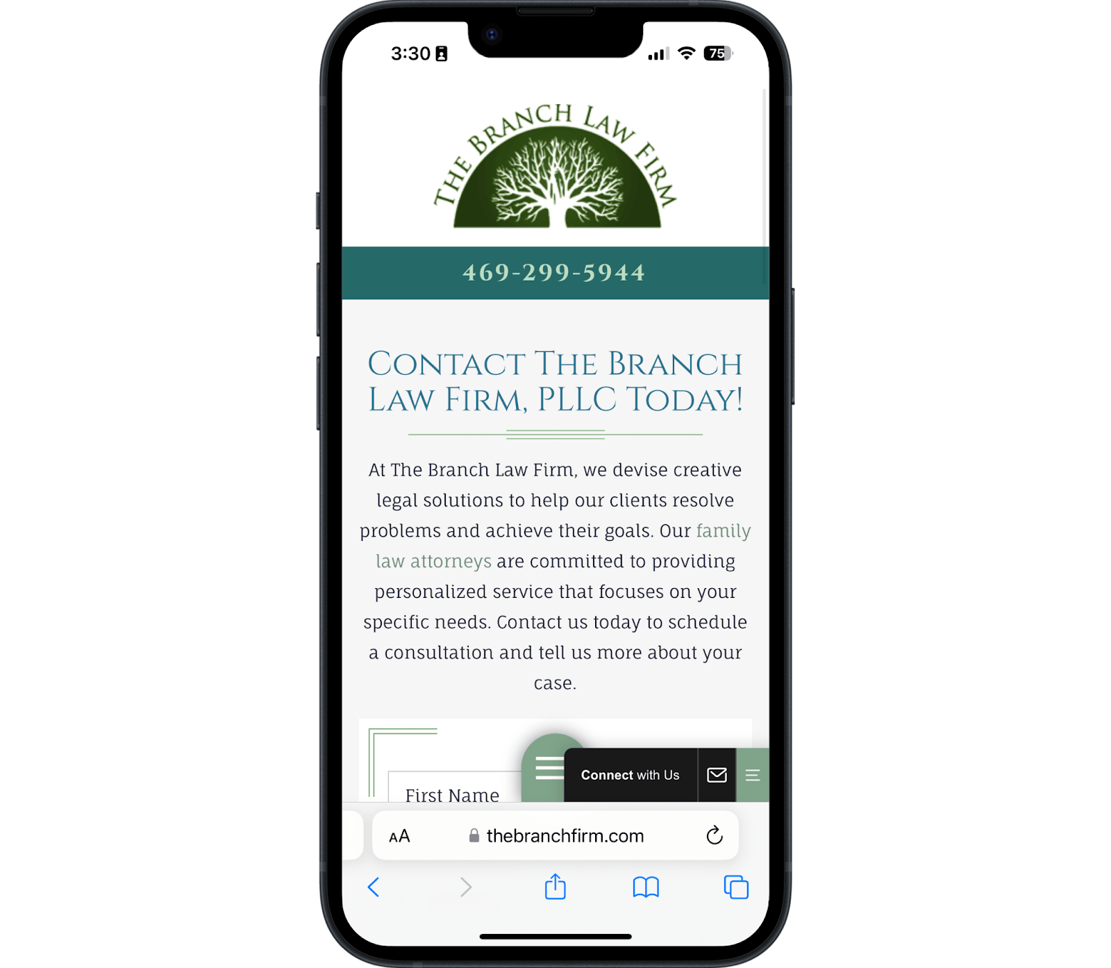
2. The Branch Law Firm
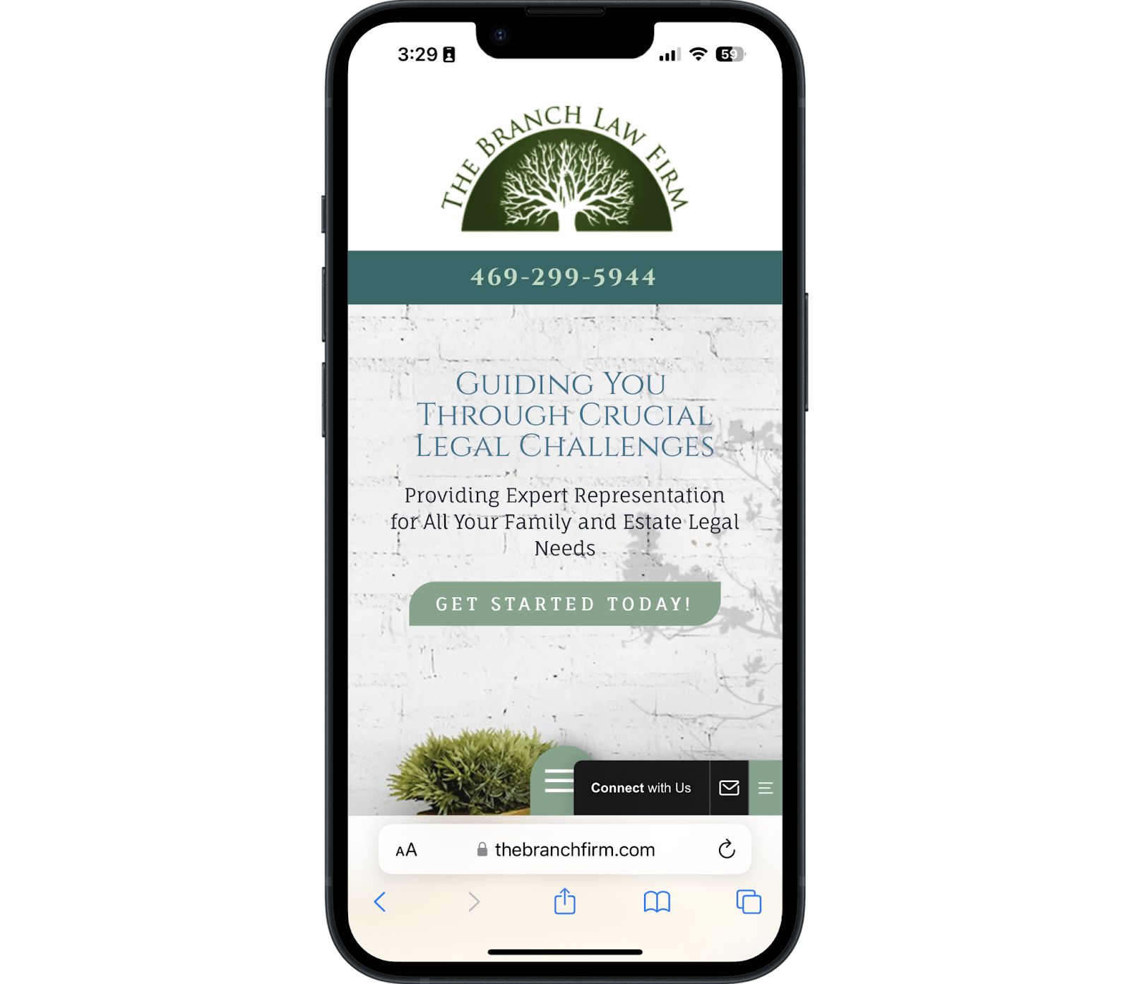
The Branch Law Firm homepage hits most of the right notes for great family law website design, but stumbles in a few key places.
Let's start with the good:
- Client-focused copy
- Chat feature for instant communication
- A "get started" CTA button
- Clickable phone number
On the other hand, there are a few opportunities to tweak this site for a better client experience. Some of the challenges include:
- The logo is too big
- There's no navigation menu
- There's not enough contrast between the background image, the text, and the CTAs
The link to the firm's service pages immediately above the fold makes the next outreach step easy for clients. The flow makes sense and allows someone to deviate from reading the text if they're already convinced this is the right firm for them.
Much like the previous site, this one has a simple contact form at the bottom for one last chance to get a conversion.
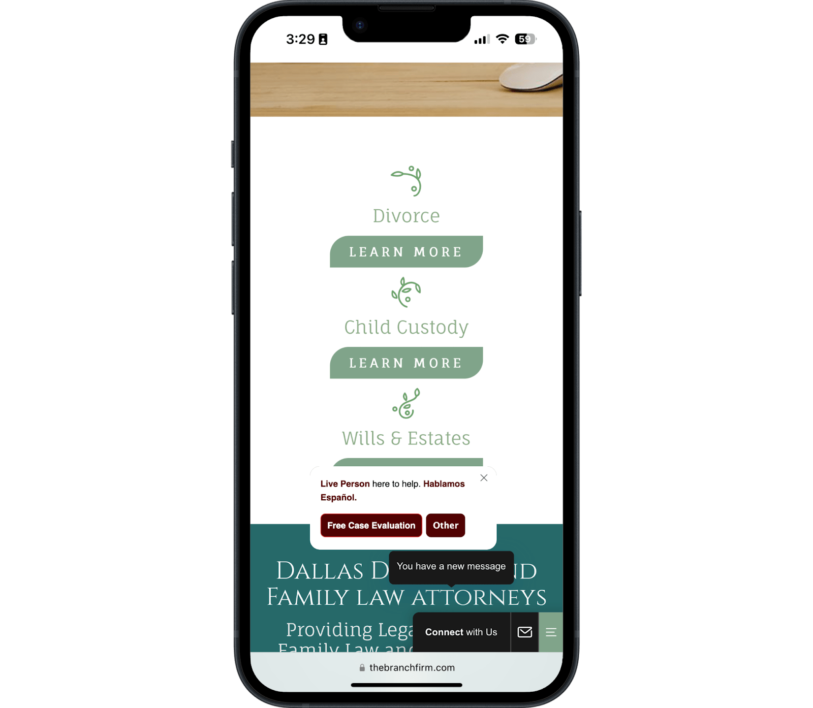
Service Pages
The service pages on this site are off to a good start but would benefit from some simple fixes.
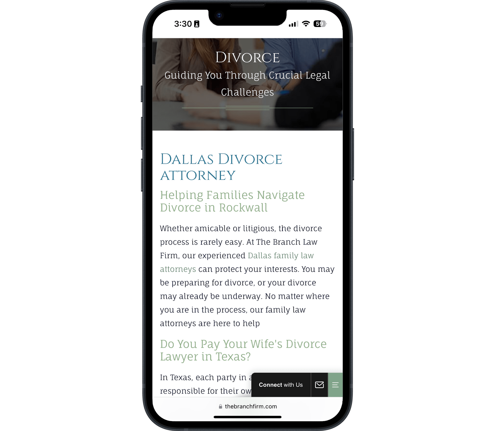
The font is easy to read with good spacing, but the logo is still too big.
The navigation menu hides under the chat feature, making it hard for someone to get to another page if they wanted to.
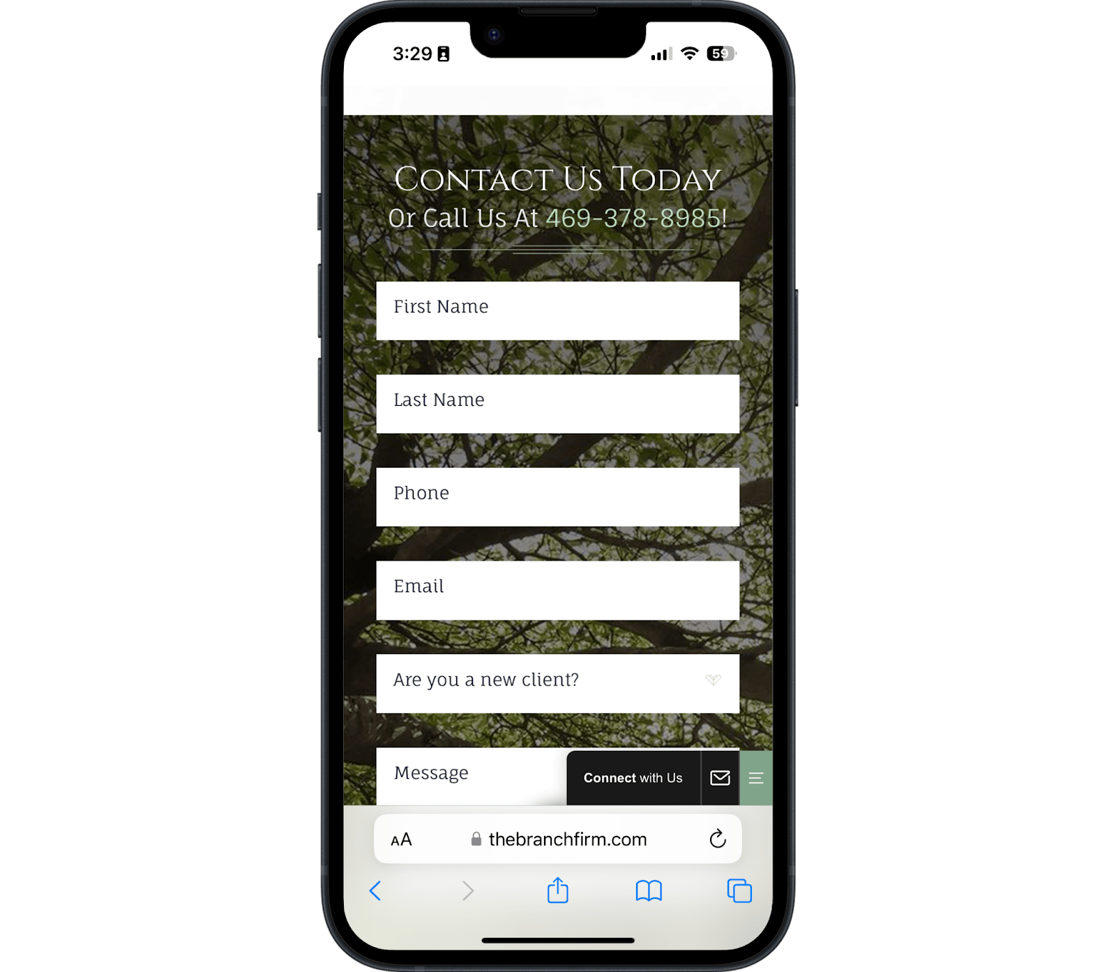
Contact Page
Two simple changes would make this contact page great.
First, the paragraph at the top of the page is distracting, especially since the page's purpose should be to encourage people to complete the form. Second, the logo is too big for the rest of the page.
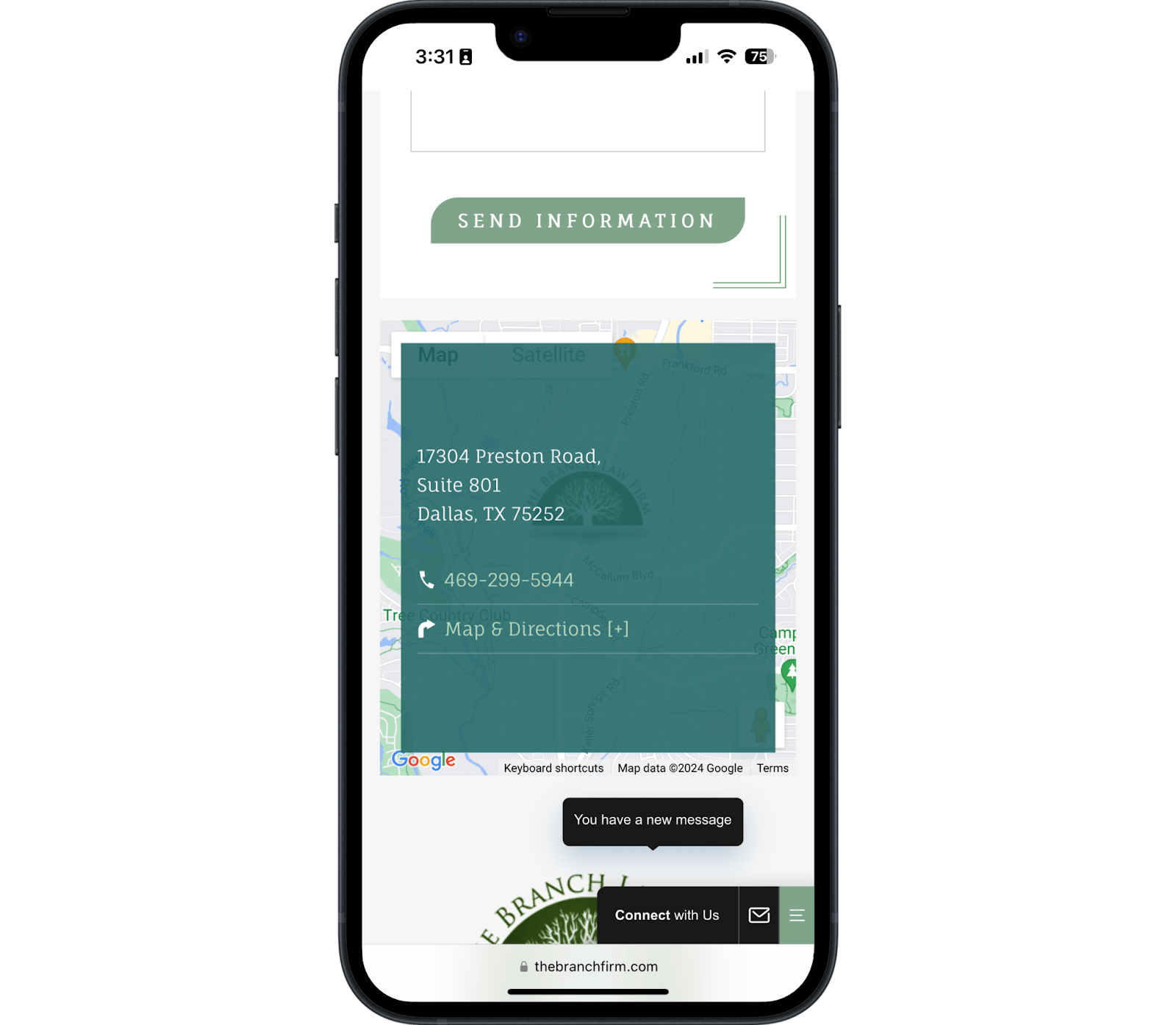
Their contact page also has a map under the form with office addresses and phone numbers, giving people multiple options to contact the firm.
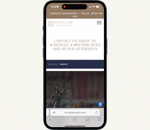
3. Just Law Utah
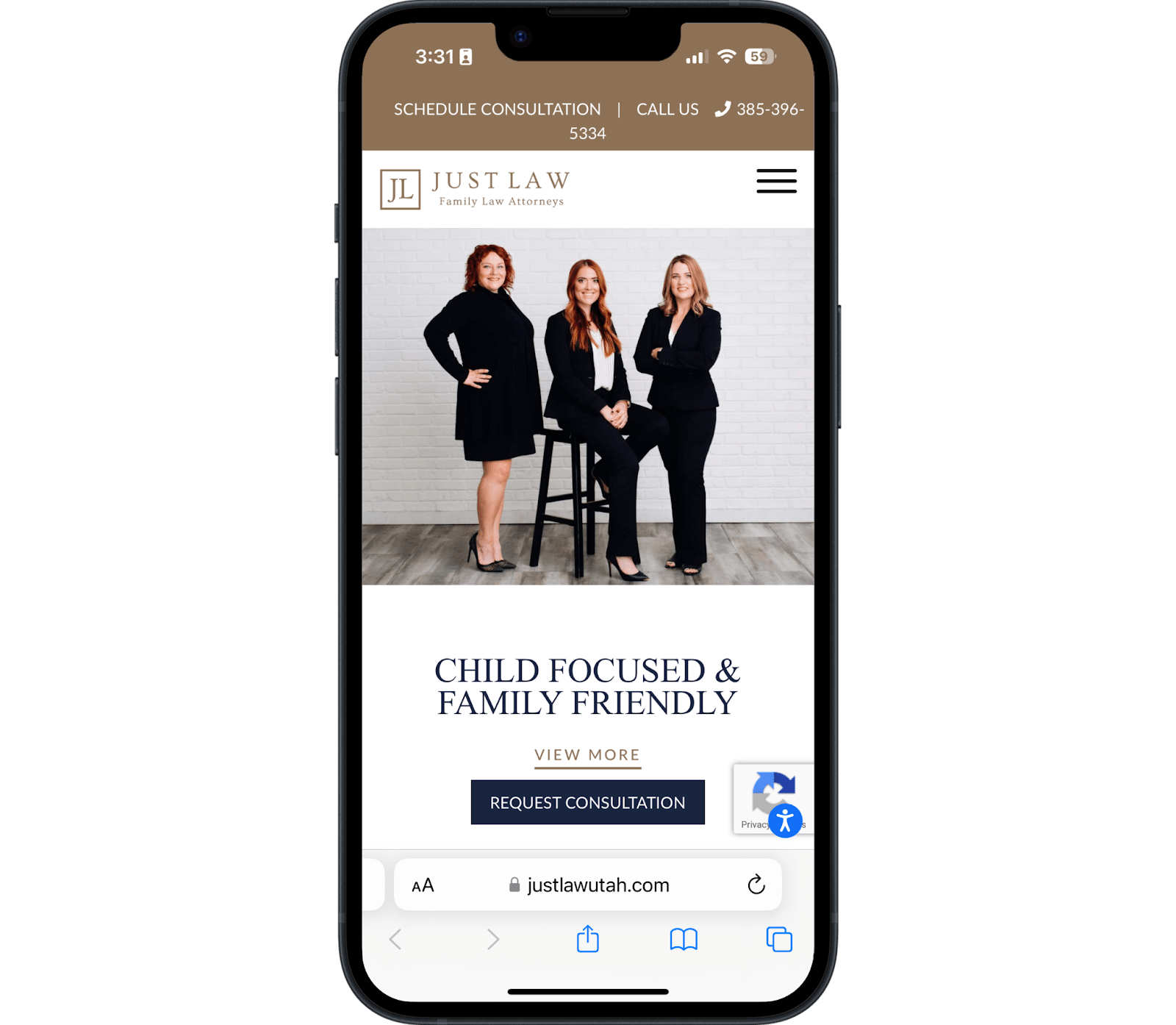
Just Law has a solid foundation. It starts with friendly, approachable, and professional photos of the attorneys.
The headline "Child Focused and Family Friendly" is compelling, too, because it instantly connects with people concerned about their children's future post-divorce.
This page is a real winner because the bottom of the contact form offers something a little different by giving visitors a choice of which attorney they want to get a hold of.
This puts the client in the driver's seat. The best family law websites prioritize user experience, and the hallmark of user experience is that it's for the user—not for the creator.
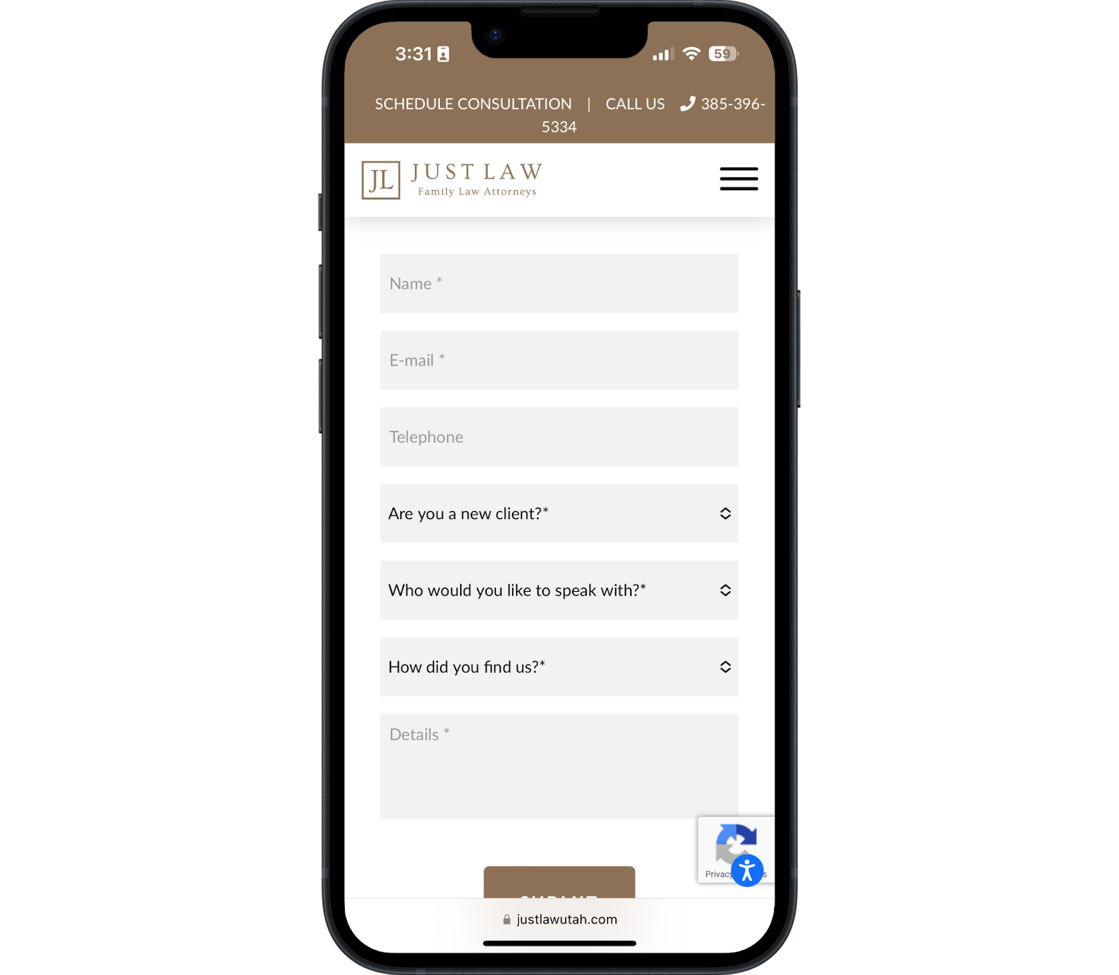
Contact Page
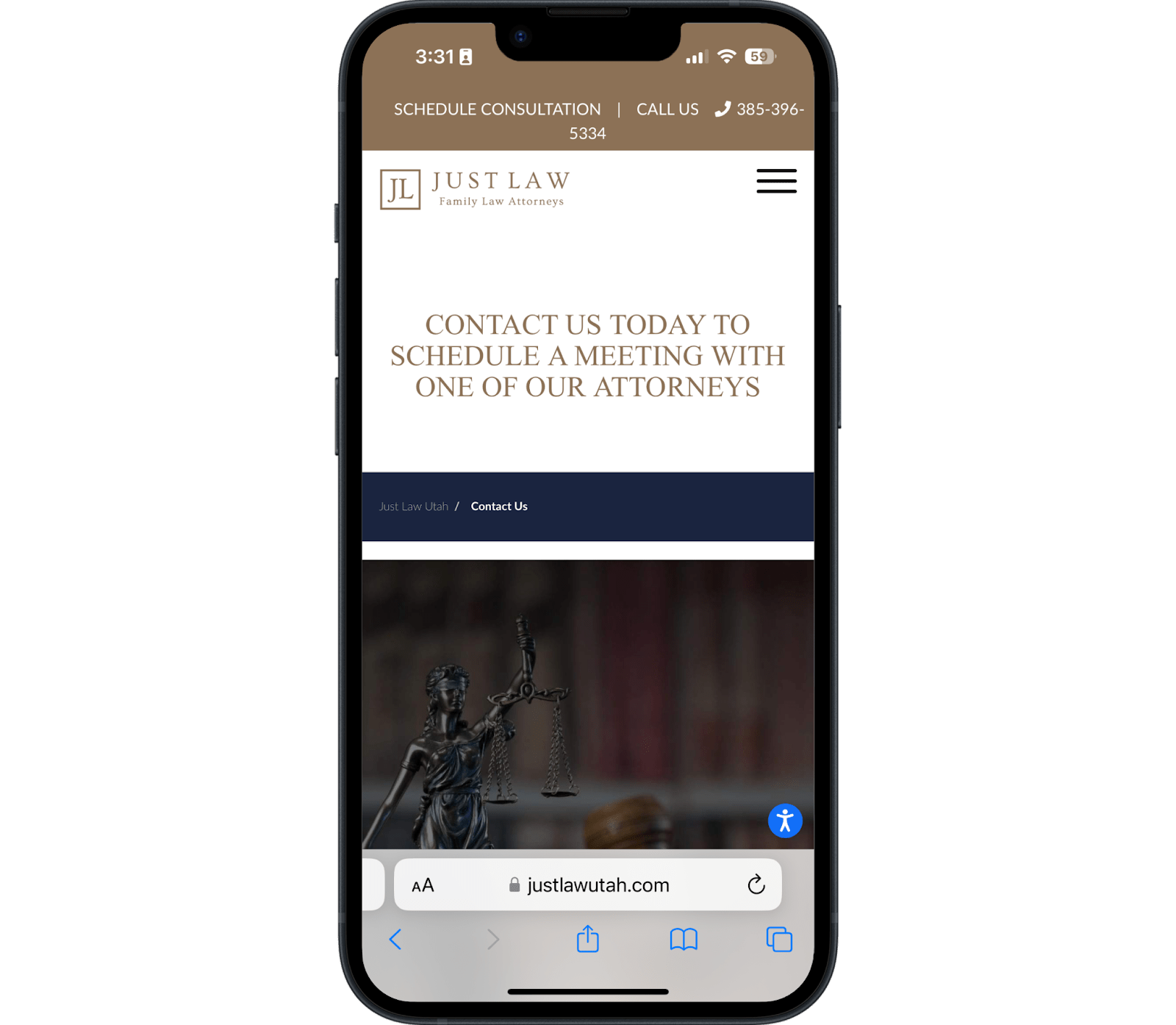
The contact page, however, has two major issues we want to point out.
First, the main image is too large for mobile devices. It pushes the page's purpose below the viewport.
You can tell that no one has optimized this site for mobile users since the desktop version is more appealing.
See how visitors have to scroll down an entire screen to see any contact information?
This adds additional friction.
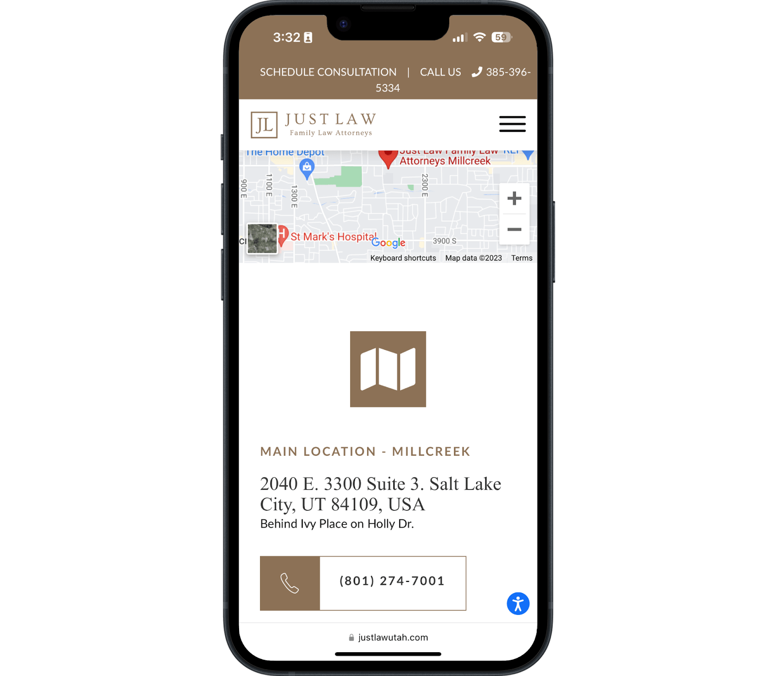
Further down the page, you can spot an interactive map, addresses, and primary contact information.
But there is something significant missing from this whole page.
There's no contact form.
People can call or come into the office, but they should also be able to submit a form on this page.
Especially since they have a contact form on their home page.
Takeaway: Remove the valueless large stock image and replace it with a contact form.
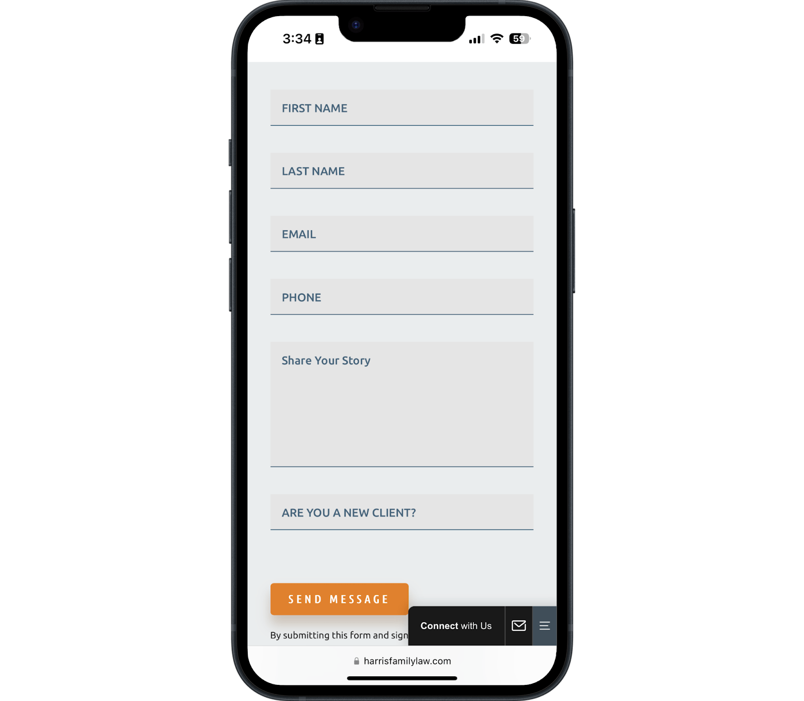
4. The Harris Law Firm
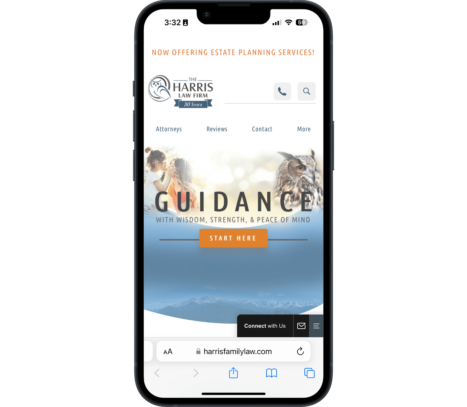
The Harris Law Firm has good copy on the homepage but could use a few improvements to drive conversions.
The copy in the hero section is very client-focused, and the site's owl theme is interesting without being tasteless. Their messaging revolves around wisdom, so an owl makes sense as an intentional brand code.
Many family law firms choose an animal like a tiger or a wolf and plaster it all over the site without any more profound thought beyond the fact that they think they're cool.
The navigation is excellent because it's focused.
Clients can choose only one of three primary options, with everything else hidden behind the “more” button.
This helps avoid the paradox of choice—but they could improve it by making the logo smaller and adding some contrast.
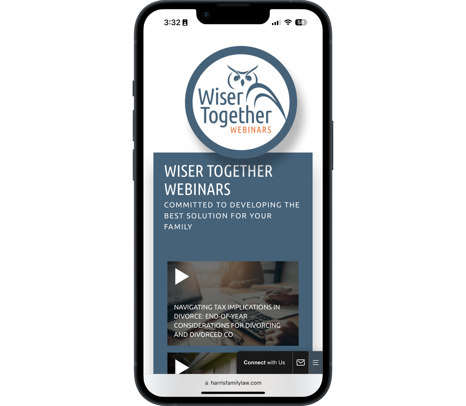
We love how this firm developed its own unique educational tool.
It's ubiquitous in other industries but rare in family law attorney websites. That gives them a strong lead magnet because it differs from other firms.
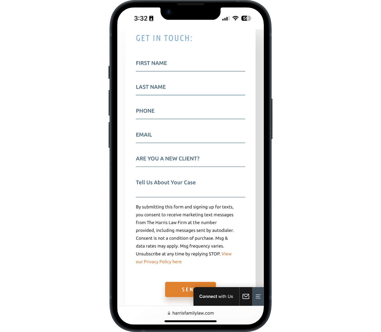
They have a simple and straightforward contact form on the home page.
There's nothing too much to note here, and that's okay—you don't have to reinvent the wheel regarding contact forms.
If you try, it may backfire.
Service Pages
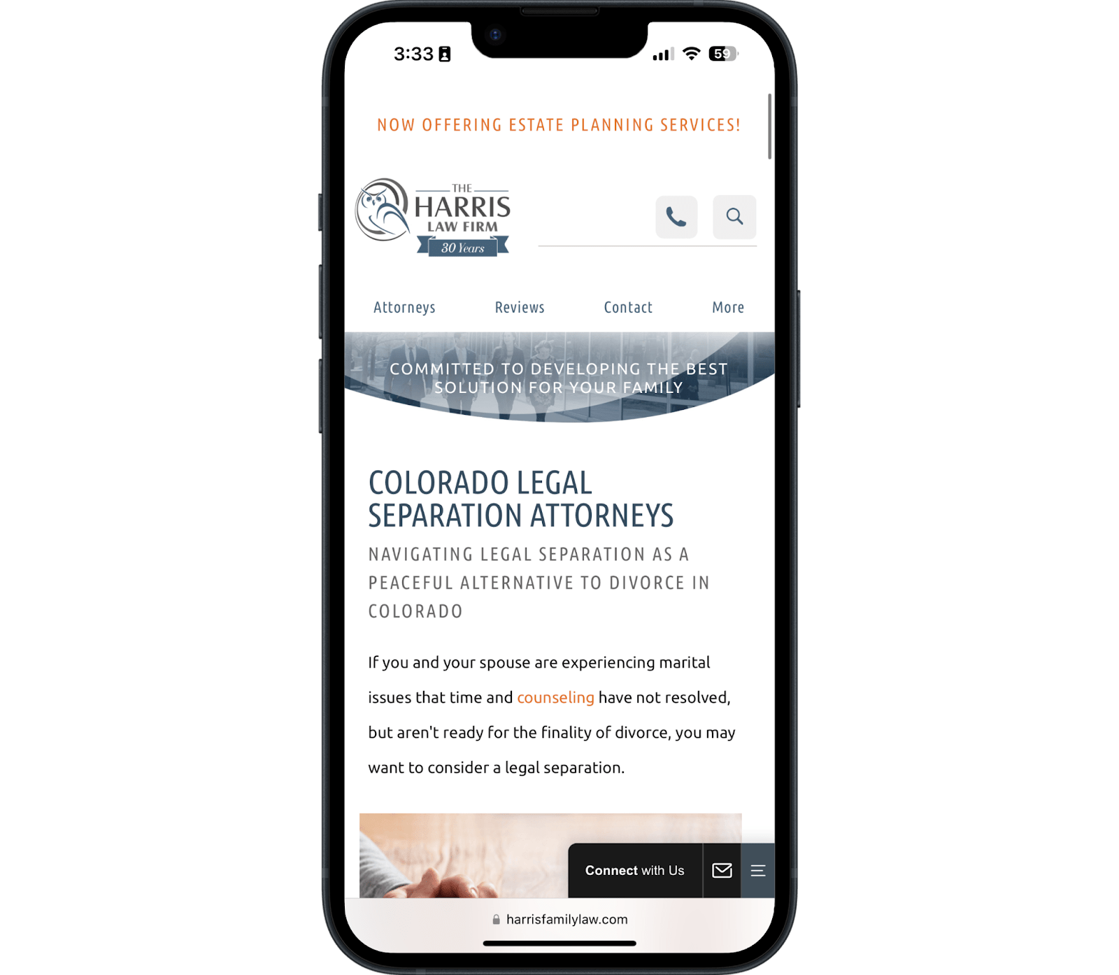
The service pages get straight to the point by placing a quick answer paragraph above the fold.
There's some wasted space at the top of the page, but overall, the page is clear, the font and the spacing work well, and any visitor can find the information they need quickly.
5. Fairway Divorce Solutions
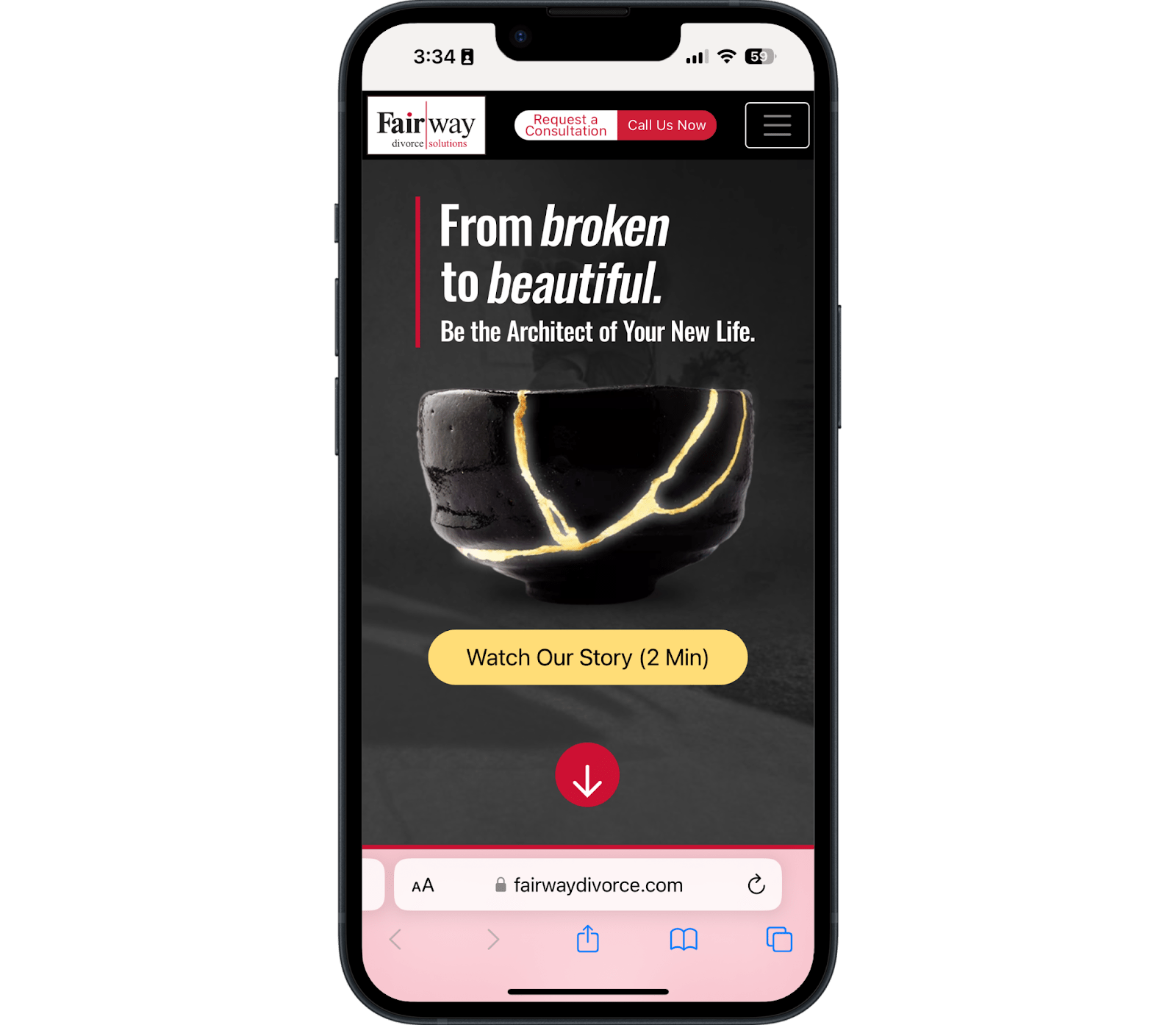
The Fairway Divorce family law firm operates from Canada but provides some great lessons on copy and design for a US audience.
Here's why we like it:
- The copy is unique and client-focused
- The image matches the core idea of the site and the service
- The logo is not too big
- There are clear contact options at the top of the page
- There's a menu button for easy navigation
Best Practices for Family Law Websites
Now that you've seen some examples of the best family law web design in action, let's discuss the technical elements that support outstanding user experience and engagement for your potential clients. There are six critical components every family law attorney website should include: modern design, accessibility, good navigation, conversion options, client-focused copy, and solid SEO.
1. Modern Design
Your site cannot afford to look like it hasn't seen an update since 2010. In today's competitive legal landscape, a modern, visually appealing design is essential to making a great first impression. A well-designed website showcases professionalism and attention to detail, traits that are crucial for a family law lawyer.
A fresh design uses contemporary color palettes, high-quality images, and visually engaging layouts that invite users to explore further. Strategic law firm branding integrated throughout your website design helps establish a cohesive professional identity that differentiates your practice from competitors.
Remember, aesthetics matter—a clean, modern appearance fosters trust and resonates with potential clients who are in the midst of challenging family law matters.
2. Accessibility
Ensuring your website is accessible is vital not just for compliance with legal standards but also for providing a welcoming experience for all users. A well-structured site accommodates individuals with disabilities and those using older devices. To support accessibility, consider the following common stumbling blocks:
- Contrast Ratios: Ensure your text contrasts sufficiently with the background so it’s legible for all users, including those with visual impairments.
- Confusing Color Schemes: Choose color combinations that are visually pleasant and easy to decipher. Certain color schemes can be overwhelming or distracting.
- Readability of Typography: Avoid using script or overly stylized fonts that can be hard to read. Instead, opt for simple, professional fonts in a readable size and weight.
- Text on Images: Refrain from placing text on busy images, as this can make the content harder to read. If necessary, use overlays to improve visibility.
- Overuse of Capitalization: While uppercase text can attract attention, excessive use can be off-putting. Stick to standard usage for better clarity.
3. Good Navigation
Every family law attorney needs their website to be easy to navigate. A well-organized layout ensures that visitors can find the information they need without frustration. To enhance navigation, include the following features:
- Main Menus in the Header Navigation: This should contain clear, concise links to your most significant practice areas, such as "Divorce," "Child Custody," "Spousal Support," or "Adoption."
- Breadcrumbs: Incorporate breadcrumb navigation at the top of your pages, allowing visitors to easily track their location within your site and return to previous sections without hassle.
- Footer Links: Adding links to critical areas (like "Contact," "About," and "FAQs") in the footer ensures that users can always find essential information, regardless of where they are on the site.
4. Conversion Options
Having clear conversion options is key to transforming website visitors into potential clients. Make sure to integrate:
- Prominent Call-to-Action (CTA) Buttons: Place CTA buttons such as "Get a Consultation" or "Contact Us" strategically throughout your site. These should stand out visually and encourage immediate engagement.
- Contact Forms: Offer easy-to-fill-out forms that make it simple for users to reach out. Limit fields to reduce friction—instead of bombarding visitors with lengthy forms, ask only essential questions to initiate the conversation.
- Easy Access to Contact Information: Display your phone number and email prominently on your site, ensuring they're easily accessible from every page. Embedded click-to-call functionality enhances the user experience for mobile visitors.
5. Client-Focused Copy
Your website's copy should prioritize the client experience. Use client-centric language that addresses the worries and needs of potential clients facing family law matters.
- Empathize with Their Situation: Understand the emotional turmoil your clients may be experiencing and incorporate that into your messaging. Use compassionate language that reflects an understanding of their challenges.
- Engaging Content: Write clear, concise, and engaging content that provides valuable information on family law issues. This could include educational blog posts, FAQs, and detailed descriptions of your services.
- Strong Case Studies or Testimonials: Consider including success stories or testimonials from past clients. This will showcase your expertise and build credibility and trustworthiness.
6. Solid SEO
Finally, having a robust SEO strategy is essential to ensure that your family law attorney website ranks well on search engines and reaches your target audience. Focus on:
- Keyword Optimization: Use relevant keywords throughout your website, particularly in your headings, content, and meta descriptions. Consider terms like “family law lawyer,” “child custody attorney,” or “divorce lawyer near me” to attract the right audience.
- Quality Content Creation: Offering insightful blog posts, guides, and resources relevant to family law matters will improve your SEO while educating your website visitors.
- Technical SEO Factors: Pay attention to site speed, mobile responsiveness, proper use of tags, and structured data. Ensuring that search engines can crawl and index your website increases your chances of appearing prominently in search results.
By incorporating these indispensable components into your family lawyer web design, you can create a user-friendly, trustworthy, and engaging online presence that effectively converts visitors into clients. A well-executed website will not only enhance your firm's reputation but will also support your growth in attracting and retaining clients facing sensitive family law issues.
How to Make Family Law Website Generate Leads
Converting website visitors into actual clients requires more than just attractive design—your family law website needs strategic lead generation elements that guide prospects toward taking action. The most successful family law practices implement proven lead generation strategies for lawyers that turn their websites into powerful client acquisition tools.
Optimize Your Contact Forms for Higher Conversions
Your contact forms are the primary gateway between prospects and your firm. To maximize conversions:
- Keep forms simple with only essential fields—name, phone number, email, and brief case description
- Avoid long, complicated forms that create friction and drive potential clients away
- Position contact forms prominently on every page, especially above the fold on your homepage and service pages
- Use clear field labels and provide helpful placeholder text to guide form completion
- Include trust signals near your forms, such as "Your information is confidential" or security badges
Implement Clear and Compelling Calls-to-Action
Every page should guide visitors toward a specific action, whether it's scheduling a consultation, downloading a divorce guide, or calling your office. Use action-oriented language like "Get Your Free Consultation," "Speak with a Family Law Expert Today," or "Download Your Custody Rights Guide."
Place these calls-to-action in multiple locations throughout your site to capture visitors at different stages of their decision-making process.
Display Social Proof Strategically
Client testimonials, case results, and professional awards build credibility and reduce hesitation:
- Feature client testimonials prominently on your homepage and throughout your site
- Include video testimonials when possible, as they're particularly powerful for family law practices
- Display professional awards, certifications, and bar association memberships
- Showcase case results where ethically permissible, focusing on positive outcomes
- Add logos of professional organizations and legal publications that have featured your firm
- Position trust signals near contact forms and calls-to-action to reinforce credibility at decision points
Create Valuable Lead Magnets
Offer downloadable resources that provide immediate value while capturing contact information. Effective lead magnets for family law practices include divorce checklists, child custody guides, property division worksheets, or collaborative divorce information packets.
These resources demonstrate your expertise while building trust with prospects who aren't ready to contact you directly.
Let People Convert the Way They Want
Provide multiple paths for people to take action.
Put your phone number on the page for people who want to call, live chat for people who want help right now, and contact forms for people who want to communicate asynchronously via email.
Work with a professional copywriter to develop client-focused web copy. Don't just let your local website design firm do it—they may be decent with design, but copy is an entirely separate profession.
Put the focus on your client's needs and how their life could change after working with you, not how great you are.
Finally, optimize it for search engines. Your whole website needs technical SEO to even be eligible to rank on search engines, not to mention the more nuanced craft of on-page and off-page SEO to get to the first page.
Your Website Has a Job: Filling Your Lead Pipeline
Within your legal practice, your family law firm's website design might seem like a small part of your digital marketing strategy, but it's still important.
A great law firm website needs multiple elements to present you as the best option for solving someone's family law matters.
Especially as a family lawyer, your website builds your online presence and shares who you are with your target audience. When considering your design, consider user-friendly elements that work well on mobile devices, too.
Consider Working With a Professional for High-Quality Family Law Website Design
Work with a professional to build the best possible website that attracts high-quality family law cases.
Anyone can build a nice site for you, but your run-of-the-mill web developer doesn't have the knowledge to help you create a site that looks good and captures search engine traffic, rankings, and lead conversions.
At Rankings.io, we've built numerous high-performing websites for law firm clients without sacrificing speed or technical SEO.
We care about user experience, functionality, and performance.
We use clean code to create fast websites, search engine optimization to get people to it, and conversion rate optimization to get you more leads.
The sites we build do more than look good—they bring in new cases.
Contact one of our expert strategists today to learn more about how we can help.